Getting started
Contents
Getting started#
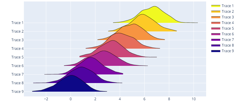
Sensible defaults#
Get started with a simple function call to ridgeplot() with sensible (plotly)
defaults.
import numpy as np

from ridgeplot import ridgeplot

# Put your real samples here...
np.random.seed(0)
synthetic_samples = [np.random.normal(n / 1.2, size=600) for n in range(9, 0, -1)]

# Call the `ridgeplot()` helper, packed with sensible defaults
fig = ridgeplot(samples=synthetic_samples)

# The returned Plotly `Figure` is still fully customizable
fig.update_layout(height=500, width=800)

# show us the work!
fig.show()
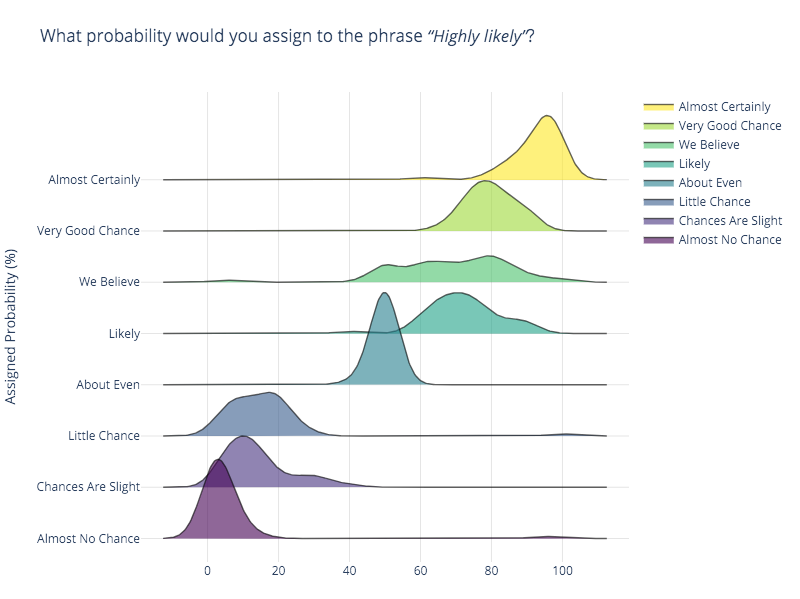
Fully configurable#
In this example, we will be replicating the first ridgeline plot example in this from Data to Viz post, which uses the probly dataset. You can find the plobly dataset on multiple sources like in the bokeh python interactive visualization library. I’ll be using the same source used in the original post.
import numpy as np
import pandas as pd
from ridgeplot import ridgeplot


# Get the raw data
df = pd.read_csv("https://raw.githubusercontent.com/bokeh/bokeh/main/bokeh/sampledata/_data/probly.csv")

# Let's grab only the subset of columns displayed in the example
column_names = [
    "Almost Certainly", "Very Good Chance", "We Believe", "Likely",
    "About Even", "Little Chance", "Chances Are Slight", "Almost No Chance",
]
df = df[column_names]

# Not only does 'ridgeplot(...)' come configured with sensible defaults
# but is also fully configurable to your own style and preference!
fig = ridgeplot(
    samples=df.values.T,
    bandwidth=4,
    kde_points=np.linspace(-12.5, 112.5, 400),
    colorscale="viridis",
    colormode="index",
    coloralpha=0.6,
    labels=column_names,
    spacing=5 / 9,
)

# Again, update the figure layout to your liking here
fig.update_layout(
    title="What probability would you assign to the phrase <i>“Highly likely”</i>?",
    height=650,
    width=800,
    plot_bgcolor="rgba(255, 255, 255, 0.0)",
    xaxis_gridcolor="rgba(0, 0, 0, 0.1)",
    yaxis_gridcolor="rgba(0, 0, 0, 0.1)",
    yaxis_title="Assigned Probability (%)",
)
fig.show()