Getting started
This page provides a quick introduction to the ridgeplot library, showcasing some of its features and providing a few practical examples. All examples use the ridgeplot.ridgeplot() function, which is the main entry point to the library. For more information on the available options, take a look at the reference page.
Basic example
This basic example shows how you can quickly get started with a simple call to the ridgeplot() function.
import numpy as np
from ridgeplot import ridgeplot

my_samples = [np.random.normal(n, size=900) for n in range(6, 0, -2)]
fig = ridgeplot(samples=my_samples)
fig.show()
By default, the ridgeplot() function will estimate the samples’ probability density functions (PDFs) using kernel density estimation (KDE) and plot them as ridgeline area traces (trace_type="area"). If you want to plot histograms instead, you can set the nbins parameter to an integer, which will automatically switch the trace type to "bar".
fig = ridgeplot(samples=my_samples, nbins=20)
fig.show()
Flexible configuration
In this example, we will try to replicate the first ridgeline plot in this from Data to Viz post. The example in the post was created using the “Perception of Probability Words” dataset (see load_probly()) and the popular ggridges R package. In the end, we will see how the ridgeplot Python library can be used to create a (nearly) identical plot, thanks to its extensive configuration options.
import numpy as np
from ridgeplot import ridgeplot
from ridgeplot.datasets import load_probly

# Load the probly dataset
df = load_probly()

# Let's grab the subset of columns used in the example
column_names = [
    "Almost Certainly",
    "Very Good Chance",
    "We Believe",
    "Likely",
    "About Even",
    "Little Chance",
    "Chances Are Slight",
    "Almost No Chance",
]
df = df[column_names]

# Not only does 'ridgeplot(...)' come configured with sensible defaults
# but is also fully configurable to your own style and preference!
fig = ridgeplot(
    samples=df.to_numpy().T,
    bandwidth=4,
    kde_points=np.linspace(-12.5, 112.5, 500),
    colorscale="viridis",
    colormode="row-index",
    opacity=0.6,
    labels=column_names,
    spacing=5 / 9,
)

# And you can still update and extend the final
# Plotly Figure using standard Plotly methods
fig.update_layout(
    height=560,
    width=800,
    font_size=16,
    plot_bgcolor="white",
    xaxis_tickvals=[-12.5, 0, 12.5, 25, 37.5, 50, 62.5, 75, 87.5, 100, 112.5],
    xaxis_ticktext=["", "0", "", "25", "", "50", "", "75", "", "100", ""],
    xaxis_gridcolor="rgba(0, 0, 0, 0.1)",
    yaxis_gridcolor="rgba(0, 0, 0, 0.1)",
    yaxis_title=dict(text="Assigned Probability (%)", font_size=13),
    showlegend=False,
)

# Show us the work!
fig.show()
The resulting ridgeline plot generated by the code above:
The target reference from the from Data to Viz post:

More traces
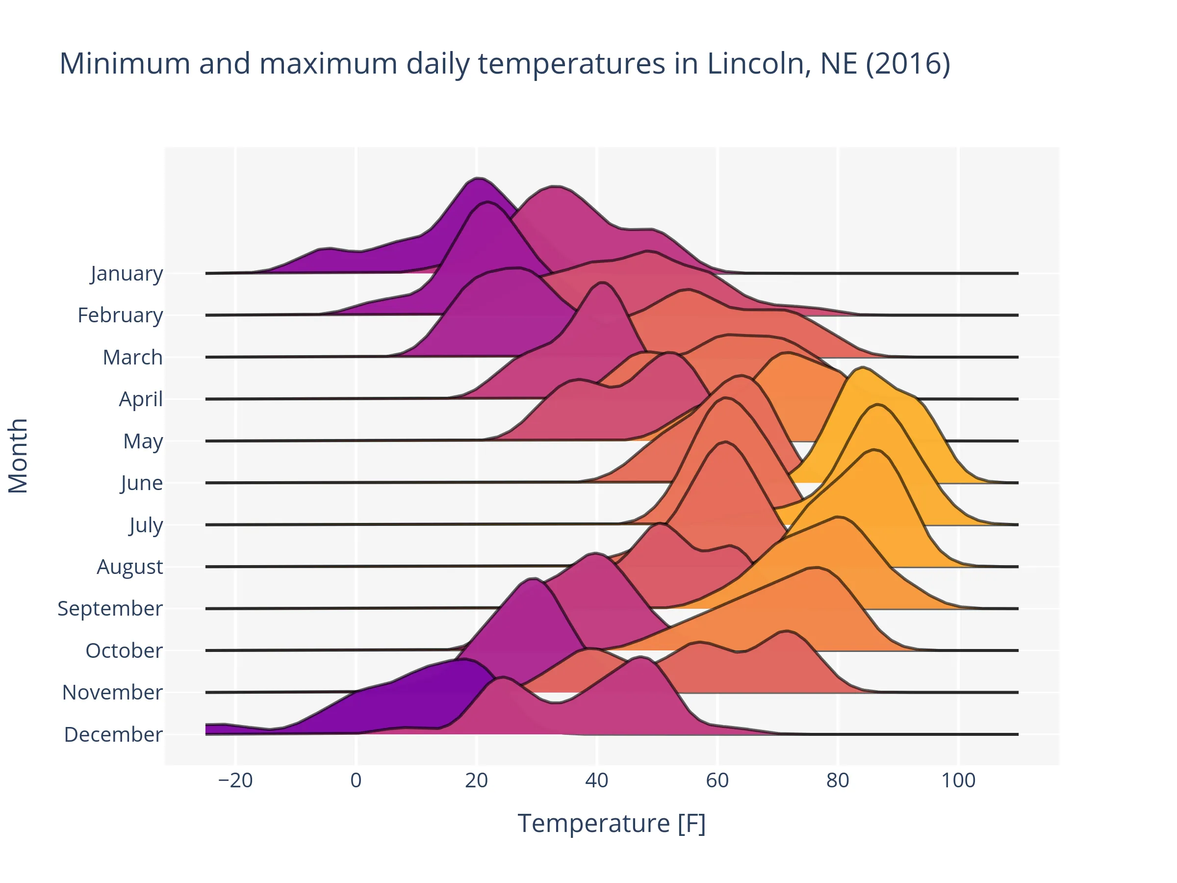
In this example, we will dive a bit deeper into the samples parameter and see how we can be used to plot multiple traces per row in a ridgeline plot.
Final result
For the ones in a hurry, we are including the entire final code-block and resulting plot already in this section. It is here also to serve as a reference for the rest of the section and to demonstrate what the goal of this example is. That said, throughout the rest of this section, we will dive a bit deeper into the samples parameter and understand how flexible it is.
import numpy as np
from ridgeplot import ridgeplot
from ridgeplot.datasets import load_lincoln_weather

# Load test data
df = load_lincoln_weather()

# Transform the data into a 3D (ragged) array format of
# daily min and max temperature samples per month
months = df.index.month_name().unique()
samples = [
    [
        df[df.index.month_name() == month]["Min Temperature [F]"],
        df[df.index.month_name() == month]["Max Temperature [F]"],
    ]
    for month in months
]

# And finish by styling it up to your liking!
fig = ridgeplot(
    samples=samples,
    labels=[["Min Temperature [F]", "Max Temperature [F]"]] * len(months),
    row_labels=months,
    colorscale="Inferno",
    bandwidth=4,
    kde_points=np.linspace(-40, 110, 400),
    spacing=0.3,
)
fig.update_layout(
    title="Minimum and maximum daily temperatures in Lincoln, NE (2016)",
    height=600,
    width=800,
    font_size=14,
    plot_bgcolor="rgb(245, 245, 245)",
    xaxis_gridcolor="white",
    yaxis_gridcolor="white",
    xaxis_gridwidth=2,
    yaxis_title="Month",
    xaxis_title="Temperature [F]",
    showlegend=False,
)
fig.show()
Step-by-step
Let’s start by loading the “Lincoln Weather” test dataset (see load_lincoln_weather()).
>>> from ridgeplot.datasets import load_lincoln_weather
>>> df = load_lincoln_weather()
>>> df[["Min Temperature [F]", "Max Temperature [F]"]].head()
            Min Temperature [F]  Max Temperature [F]
CST
2016-01-01                   11                   37
2016-01-02                    5                   41
2016-01-03                    8                   37
2016-01-04                    4                   30
2016-01-05                   19                   38
The goal will be to plot the KDEs for the minimum and maximum daily temperatures for each month of 2016 (i.e. the year covered by the dataset).
>>> months = df.index.month_name().unique()
>>> months.to_list()
['January', 'February', 'March', 'April', 'May', 'June', 'July',
 'August', 'September', 'October', 'November', 'December']
The samples argument in the ridgeplot() function expects a 3D array of shape \((R, T_r, S_t)\), where \(R\) is the number of rows, \(T_r\) is the number of traces per row, and \(S_t\) is the number of samples per trace, with:
Dimension values |
Description |
|---|---|
\(R=12\) |
One row per month. |
\(T_r=2\) (for all rows \(r \in R\)) |
Two traces per row (one for the minimum temperatures and one for the maximum temperatures). |
\(S_t \in \{29, 30, 31\}\) |
One sample per day of the month, where different months have different number of days. |
We can create this array using a simple list comprehension, where each element of the list is a list of two arrays, one for the minimum temperatures and one for the maximum temperatures samples, for each month:
samples = [
    [
        df[df.index.month_name() == month]["Min Temperature [F]"],
        df[df.index.month_name() == month]["Max Temperature [F]"],
    ]
    for month in months
]
Note
For other use cases (like in the two previous examples), you could use a numpy ndarray to represent the samples. However, since different months have different number of days, we need to use a data container that can hold arrays of different lengths along the same dimension. Irregular arrays like this one are called ragged arrays. There are many different ways you can represent irregular arrays in Python. In this specific example, we used a list of lists of pandas Series. However, ridgeplot() is designed to handle any object that implements the Collection[Collection[Collection[Numeric]]] protocol (i.e., any numeric 3D ragged array).
Finally, we can pass the samples list to the ridgeplot() function and specify any other arguments we want to customize the plot, like adjusting the KDE’s bandwidth, the vertical spacing between rows, etc.
fig = ridgeplot(
    samples=samples,
    labels=[["Min Temperature [F]", "Max Temperature [F]"]] * len(months),
    row_labels=months,
    colorscale="Inferno",
    bandwidth=4,
    kde_points=np.linspace(-40, 110, 400),
    spacing=0.3,
)

fig.update_layout(
    title="Minimum and maximum daily temperatures in Lincoln, NE (2016)",
    height=600,
    width=800,
    font_size=14,
    plot_bgcolor="rgb(245, 245, 245)",
    xaxis_gridcolor="white",
    yaxis_gridcolor="white",
    xaxis_gridwidth=2,
    yaxis_title="Month",
    xaxis_title="Temperature [F]",
    showlegend=False,
)
fig.show()
Coloring options
Note
We are currently investigating the best way to support all color options available in Plotly Express. If you have any suggestions or requests, or just want to track the progress, please check out #226.
The ridgeplot() function offers flexible customisation options that help you control the exact coloring of ridgeline traces. Take a look at colorscale, colormode, color_discrete_map, opacity, and line_color for a detailed description of the available options.
As a simple (but quite common) example, we’ll try to adjust the output of the previous example to use different discrete colors for the minimum and maximum temperature traces. Specifically, we’ll set all minimum temperature traces to a shade of blue and all maximum temperature traces to a shade of red. To achieve this, we just need to set the color_discrete_map parameter to a dictionary that maps the trace labels to the desired colors.
Note
Because the color_discrete_map parameter takes precedence over the colorscale and colormode parameters, we can keep them as they are in the previous example. However, since their behavior will be overridden by color_discrete_map, it is a good practice to remove them from the function call to avoid any confusion.
fig = ridgeplot(
    # Same options as before, with the
    # addition of `color_discrete_map`
    # ...
    color_discrete_map={
        "Min Temperature [F]": "deepskyblue",
        "Max Temperature [F]": "orangered",
    }
    # ...
)
Theming with Plotly templates
Since ridgeplot is built on top of Plotly, you can also theme your ridgeline plots using Plotly’s figure templates. Simply pass the name of a registered template (or any other valid template representation) to the template parameter. For instance, taking the basic example from the top of this page and applying the "plotly_dark" template:
fig = ridgeplot(samples=my_samples, template="plotly_dark")
fig.show()
Note
Unless a custom colorscale is specified, the default colorscale will also be inferred from the specified template.